 Русский
 English
 日本語
 Deutsch
 한국어
 العربية
 Türkçe
 Português
 Français
Проектирование зон печати на стеклянных косметических флаконах: изгибы, плечики и размещение логотипа
Your logo looks perfectly centered in the artwork file. On the printed serum bottle, it seems to bend around the sides. The smallest text fades near the shoulder, and a decorative line stops awkwardly at the back.
The artwork was prepared as a flat image without defining its position on the glass.
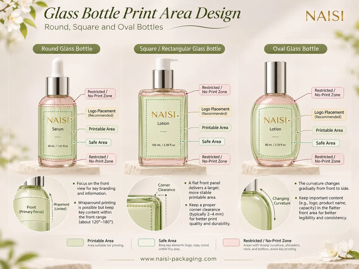
This guide covers glass bottle print area design after direct screen printing has already been selected. It explains print layouts for round, square and oval bottles and what to send the supplier.
Understand the Printable Area Before Placing Artwork
A bottle may have a large visible body, but only part of it may be suitable for a particular print setup. Distinguish three areas on the bottle drawing:
Printable area: The surface the supplier has confirmed can be decorated with the selected process.
Safe layout area: The portion reserved for important elements such as the brand logo, product name and fine text, allowing for the agreed placement variation.
Restricted or no-print area: Zones where a shoulder transition, bottom radius, mold seam, fixture or other limitation prevents reliable printing—or needs separate testing.
These zones depend on the bottle and equipment.
Ask for a dimensioned front view and, where relevant, side or developed views. Mark the front centerline, intended print height, bottle orientation and any known seam positions. If the supplier has not confirmed the boundaries, label them proposed, rather than issuing the artwork as production-ready.
The goal of glass bottle print area design is a layout the decorator can reproduce consistently.
Plan Artwork Around the Bottle Shape
Round Bottles: Control the Front View and Wrap
Straight cylindrical serum and lotion bottles provide a predictable path for suitable rotary screen-printing equipment.
A true cylinder has a circumference of diameter × π, but that does not guarantee a full uninterrupted print wrap. The supplier must confirm printable width, start and stop limits, and how the bottle will be positioned during printing.
A wide logo can wrap beyond the central viewing area. From the front, its edges then appear compressed around the curve, even if the printed artwork maintains its intended proportions on the surface. For primary branding, place the most important lettering where it remains legible from the intended front view.
Define front and back orientation. For wraparound artwork, agree on the start, end and any required join or gap.
Keep fine text away from sharp shoulder and base transitions unless the decorator has qualified those zones. Do not apply a universal stretching percentage to a straight cylinder. Any prepress adjustment should come from the actual bottle geometry and print trial.
Square and Rectangular Bottles: Use the Flat Panel Carefully
A broad flat face offers a relatively stable area for logos and product names.
Many “square” bottles have rounded corners, bevels or slightly curved faces. A graphic placed close to the edge in a digital mock-up may cross into a transition the printing equipment cannot cover reliably.
Keep the main logo comfortably within the supplier-confirmed front panel. Where a design uses several faces, supply a separate view for each decorated panel and identify its orientation. For example, the front may carry the logo and product name, while the back holds short instructions or other approved information.
Do not assume printing can continue around a sharp corner. Check the shoulder transitions as well.
Oval Bottles: Design for Changing Curvature
Oval bottles are not equivalent to round cylinders.
Curvature changes around the body. On many oval shapes, the broad front presents a gentler viewing area while the narrow sides turn away more sharply. The exact printable region depends on the real cross-section and the chosen equipment.
Put the logo and essential text in the most stable, front-facing area. Avoid spreading small lettering far toward the side transitions simply to fill the available width. Evenly spaced lines in a flat file may look uneven on the curved bottle.
An oval bottle generally needs its own print-area drawing and positioning approach. Reusing a cylindrical wrap file because the bottles have similar nominal dimensions is a poor starting point. Ask the supplier to confirm the feasible artwork field on the selected oval bottle before refining details.
Four Artwork Rules That Apply to Every Shape
Protect text and fine lines. The smallest printable lettering and stroke width depend on the ink system, screen, glass surface and equipment. Ask the supplier to confirm practical limits using your actual font and artwork. Do not copy a minimum size from an unrelated packaging project.
Treat shoulders and edges as conditional areas. A prominent logo, fine product descriptor or small instructions usually belong on a more stable body surface. Decorative elements may extend closer to a transition only if the printer confirms acceptable results.
Mark seams and print joins separately. A glass mold seam is a feature of the container. A print join is where a wraparound graphic starts or ends. They may be near each other, but they are not the same thing. Identify both when relevant and ask the supplier to establish the appropriate clearance.
Plan colors and solid areas for the chosen process. Multi-color screen printing requires registration between colors. Very fine overlapping elements and large solid ink fields may need special attention to coverage and alignment. Clearly identify spot colors and any printing sequence that matters. Final ink appearance should be approved on the intended clear, frosted or coated glass surface.
These rules do not replace a physical sample.
Three Common Artwork Problems—and Better Decisions
Example 1: The round-bottle logo looks squeezed at the edges. A brand places a long wordmark across most of a narrow cylinder. From a straight-on view, the outer letters turn away and become difficult to read. The better approach is to reduce the wordmark's horizontal coverage or adjust its front-facing composition, then review a printed sample from normal viewing angles.
Example 2: A line breaks near a square-bottle corner. The design extends a fine border to the very edge of a nominally flat panel. The actual bottle has a rounded corner and the print stops before the transition. Moving the border inward to the approved print boundary produces a more controlled result.
Example 3: Small text loses clarity near an oval shoulder. A designer places a fine descriptor high on a changing-radius surface. The print is less consistent than on the body. Shifting the text down into the confirmed safe area gives the artwork a better chance of reproducing clearly.
These are illustrative scenarios, not NAISI customer cases. Correct the layout to fit the actual bottle.
What to Send Your Glass Bottle Printing Supplier
Send a concise package before screens and samples are prepared:
Brand or designer provides | Supplier confirms |
Bottle model, capacity and available drawing | Actual printable width, height and restricted zones |
Vector logo and artwork, with fonts outlined where needed | Minimum reproducible text and line details |
Front, back and side placement views | Bottle orientation and positioning method |
Artwork dimensions and reference points in millimeters | Placement limits and print registration feasibility |
Spot-color references and intended glass finish | Ink appearance and process suitability on the actual surface |
Intended front-view appearance and sample priorities | First printed sample for approval |
For a round bottle, include a developed artwork view if requested, together with the front-view mock-up. For a square bottle, identify which panels carry printing. For an oval bottle, include front and side views so the supplier can judge the design against changing curvature.
A rendering supports the vector file and dimensioned drawing; it cannot replace them. Identify the artwork revision.
Approve the Printed Bottle, Not Just the File
Review the first physical sample from the front, quarter view and back. Check the logo's visual proportions, print position, small-text clarity, edges, color registration and any wraparound join. Compare several samples when placement consistency matters.
If the result needs adjustment, record the change and approve a revised physical sample before bulk printing. The goal is a documented, repeatable layout on the chosen bottle.
Design for the Glass Bottle in Front of You
Good glass bottle print area design begins with the real shape: round-bottle wraps, square-bottle boundaries and oval-bottle curvature need different layouts.
At NAISI Packaging, we supply glass serum bottles and other cosmetic glass packaging with silk-screen printing and customization options. If you are developing a printed serum or lotion bottle, share the bottle reference, target capacity, logo artwork, preferred colors and estimated order quantity. We can discuss suitable bottle choices and printing customization for your project.
For related background, see our articles on screen printing versus labels and skincare packaging design specifications.
WhatsApp: +86 189 2275 3052
Email: naisipackaging@gmail.com
Website: www.naisi-packaging.com
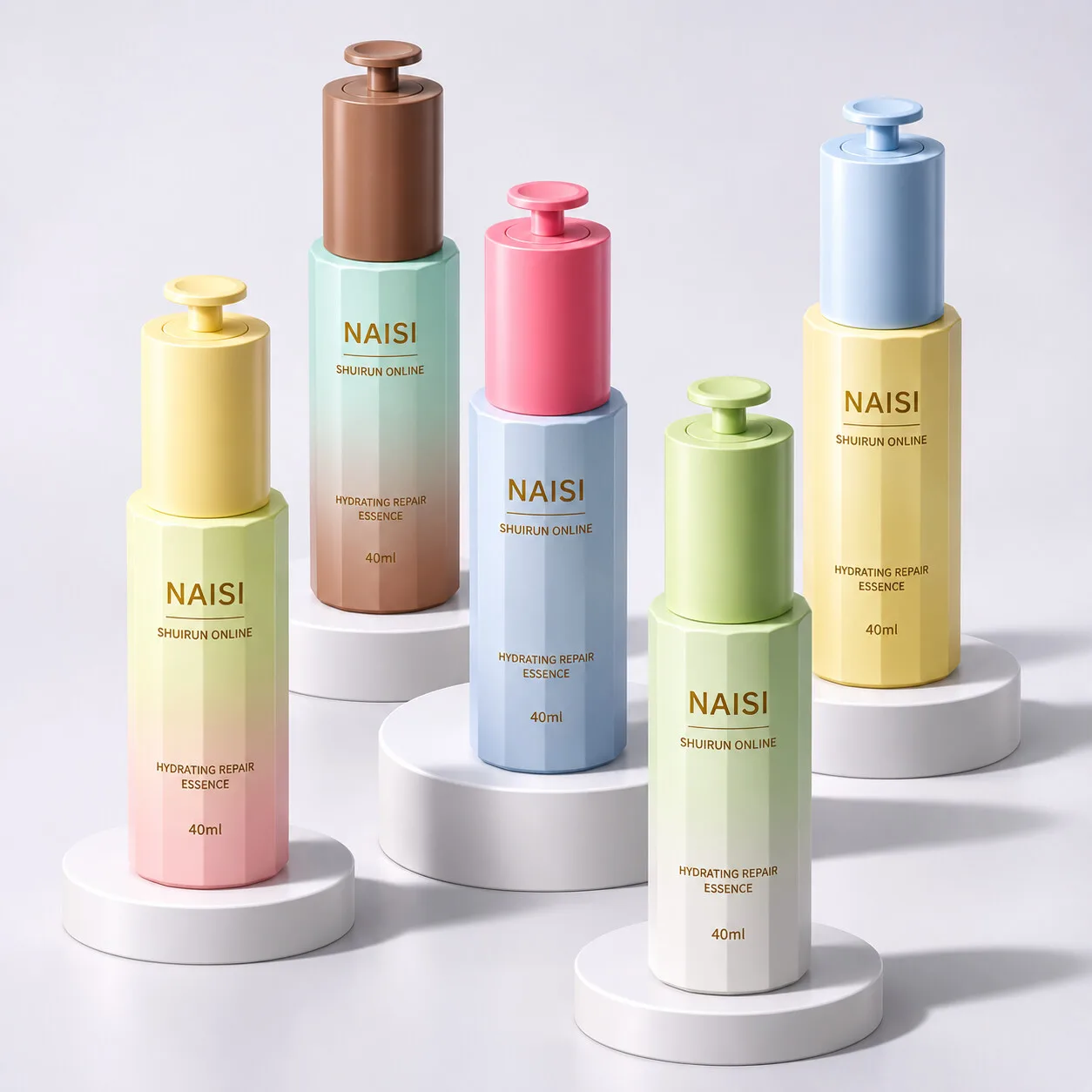
Граненые стеклянные флаконы для эссенции с помпой 40 мл в пастельных градиентных цветах
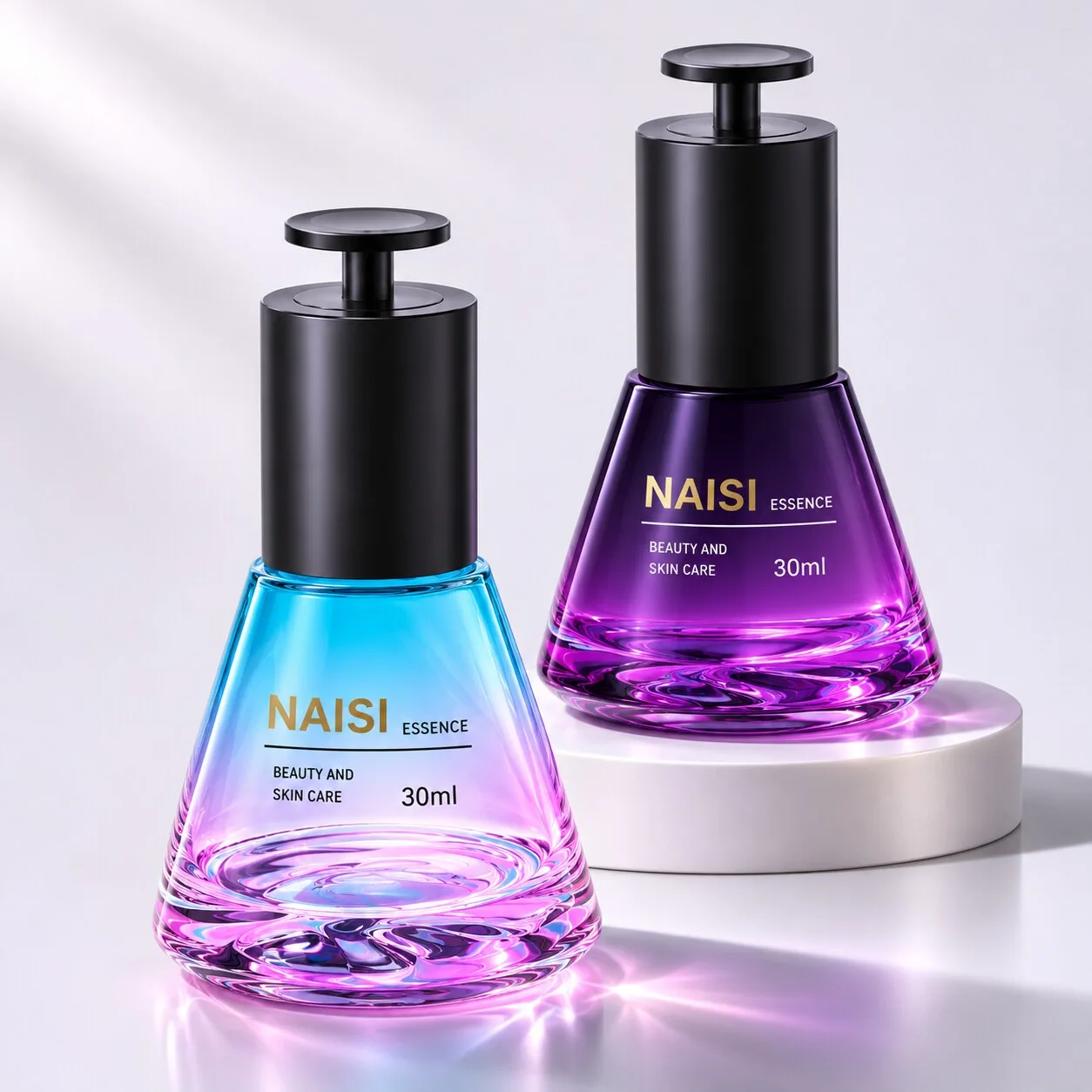
Конический стеклянный флакон для сыворотки с помпой 30 мл и черным дисковым нажимом
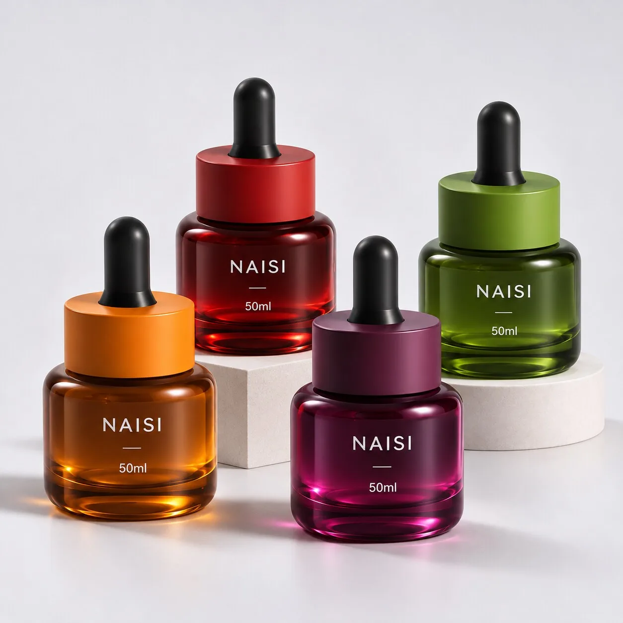
Флаконы-капельницы для сыворотки для лица из стекла насыщенных оттенков 50 мл
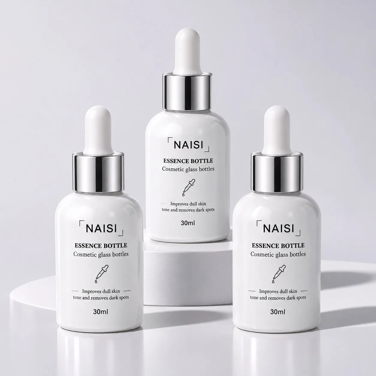
Флакон-капельница для сыворотки из непрозрачного белого стекла 30 мл
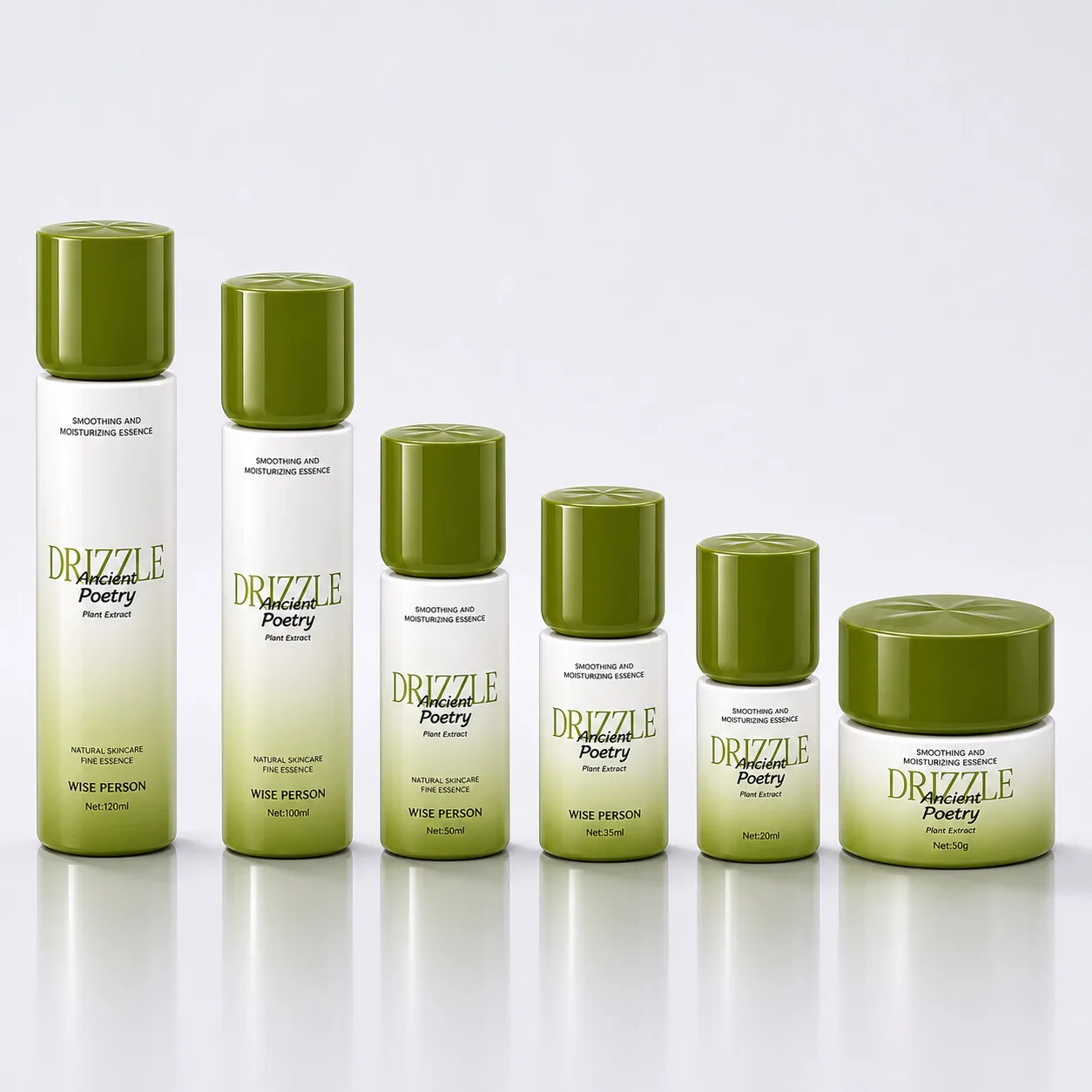
Набор цилиндрических стеклянных флаконов и баночки для ухода с бирюзовым градиентом