English
 日本語
 Deutsch
 한국어
 العربية
 Русский
 Türkçe
 Português
 Français
Screen Printing vs Labels on Cosmetic Glass Bottles: What Should Beauty Brands Consider?
Once a beauty brand has selected its glass bottle, another practical question usually comes next.
Should the logo and product name be printed directly onto the glass, or should the bottle use a pressure sensitive label?
It sounds like a simple design choice. In production, the decision affects artwork flexibility, SKU management, appearance, lead time and the way product information is handled across different markets.
Bottle geometry matters too.
A broad flat panel gives the decoration team more freedom. A cylindrical bottle needs artwork planned around the radius. Strong shoulders and compound curves reduce the usable decoration area for both printing and labels.
This is why screen printing vs labels on glass bottles should be considered before final artwork approval.
The right option depends on the bottle shape, graphic complexity, number of SKUs, expected order pattern and the amount of information that needs to appear on the pack.
This guide focuses only on those two decoration routes.
It is written for beauty and fragrance brands that need a practical purchasing decision rather than a general overview of every glass decoration process.
Basic difference: Screen printing vs pressure-sensitive labels
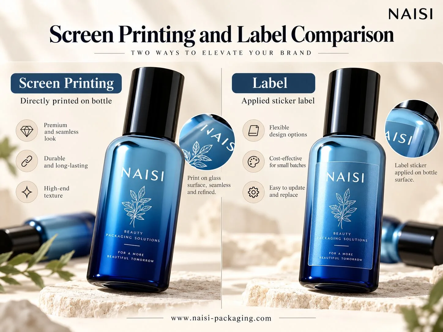
Screen printing applies ink directly onto the glass surface through a prepared screen.
The printed bottle is then cured according to the selected ink system and production process. Because the artwork sits directly on the bottle, there is no separate label edge.
This creates a clean, integrated appearance.
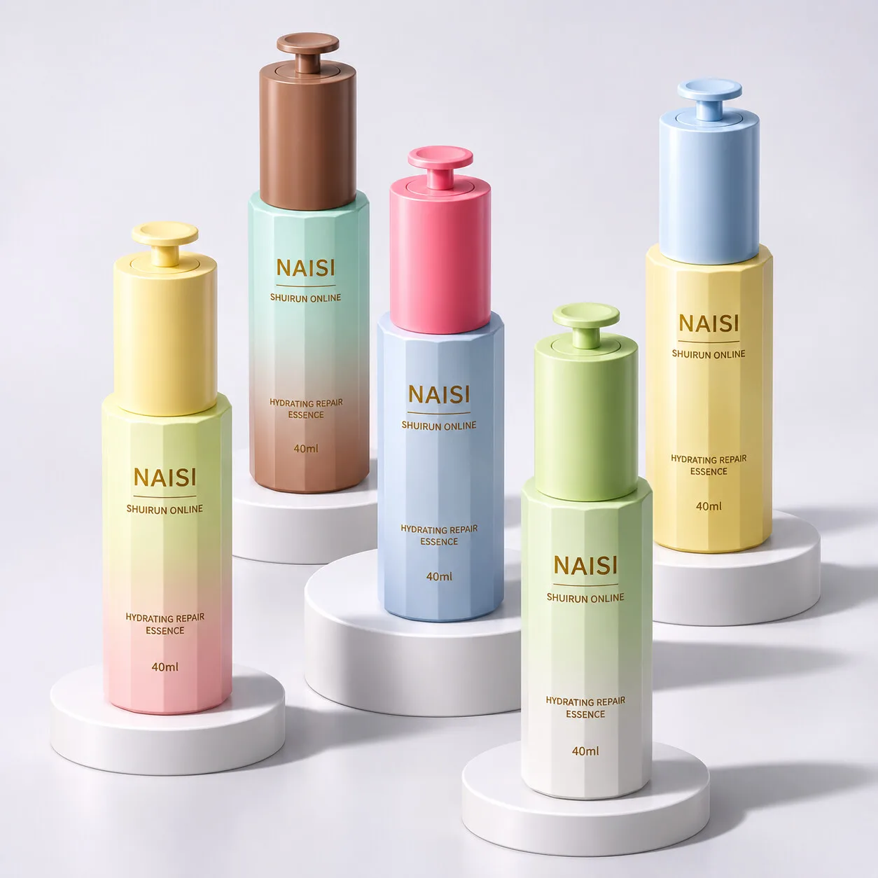
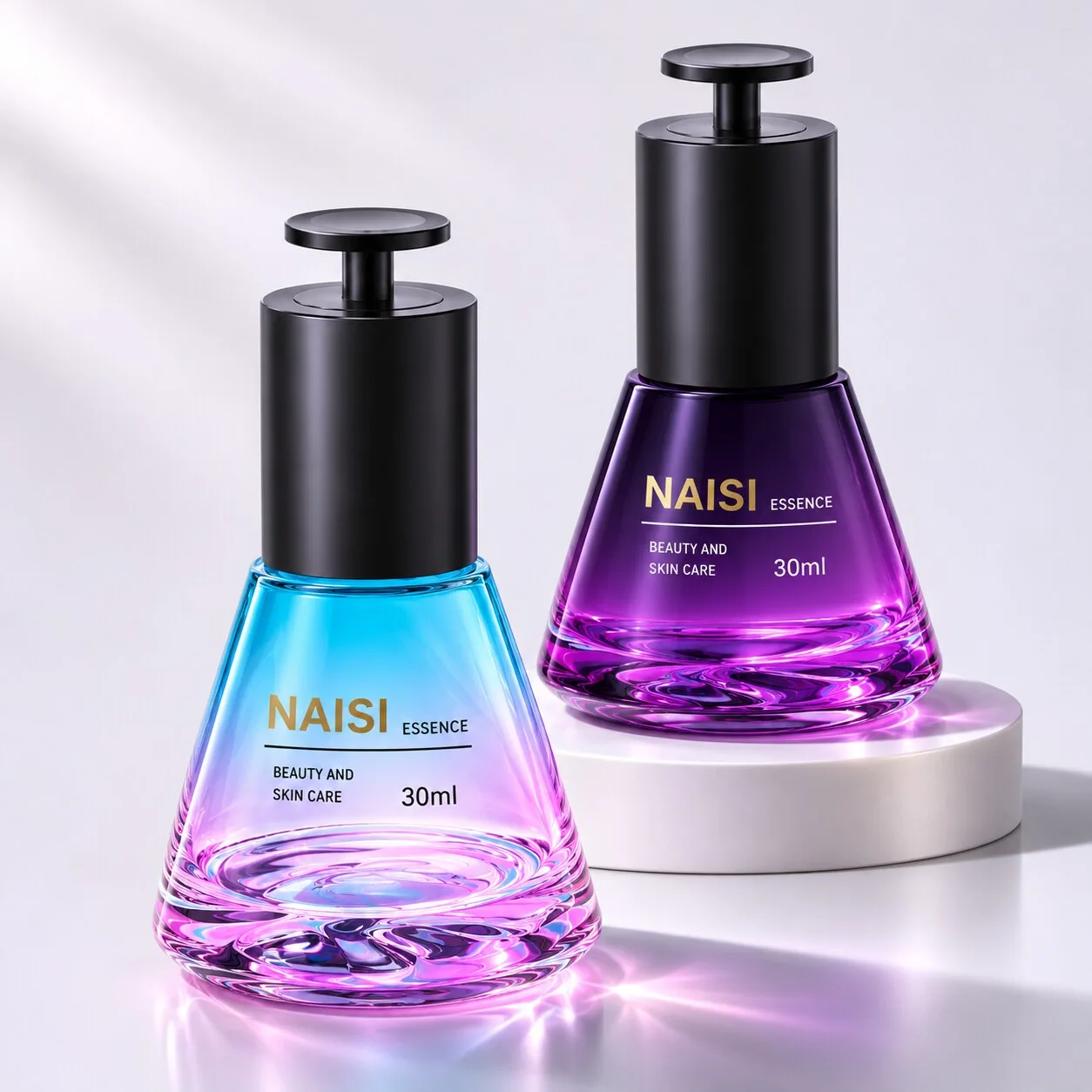
For that reason, cosmetic bottle screen printing is often well suited to logos, product names and simple spot color graphics.
Durability depends on the actual printing system.
Ink type, glass surface preparation and curing conditions all influence adhesion and resistance. If the finished bottle may come into contact with fragrance alcohol, oils or other formulas, resistance should be evaluated under the intended product conditions.
Pressure sensitive labels, often called PSLs, follow a different process.
The artwork is printed onto a label material first. The finished label is then applied to the bottle using an adhesive selected for the glass surface, bottle geometry and expected use conditions.
Labels offer greater graphic freedom.
Full color artwork, gradients, detailed illustrations and dense text can usually be managed more easily on a label. Artwork can also be changed while keeping the same glass bottle.
The finished look is different.
A label introduces another material layer, and its edge remains part of the design. Premium films, clear materials, textured papers and carefully selected adhesives can still create a refined result.
A simple way to separate the two options is:
Screen printing integrates the branding with the glass. Labels give the brand more flexibility to change information and graphics.
Bottle geometry: usable decoration zones for round /square/curved glass
Bottle shape should guide the decoration plan.
A square or rectangular bottle with a broad flat face is generally friendly to both screen printing and labeling.
A logo can sit on the panel with limited visual distortion. A correctly sized label can also be positioned cleanly on the same surface.
Straight cylindrical bottles are different, but they can still be suitable for screen printing.
Equipment designed for cylindrical decoration allows the bottle to rotate during printing. The usable print area still depends on the bottle diameter, artwork width and supplier capability.
Labels can also wrap around round bottles.
For these applications, label length, face material, adhesive and application accuracy become increasingly important as the label covers more of the bottle circumference.
Compound curves require more planning.
A perfume bottle may narrow toward the shoulder. A skincare bottle may have a curved body that changes diameter from top to bottom.
Screen printing across these areas becomes more difficult because consistent contact and registration are harder to maintain when the radius changes.
Labels face another challenge.
A flat label naturally prefers a stable surface. When it is applied over a strong compound curve, the material may need to accommodate stretching or compression. Poorly matched label geometry can lead to wrinkles, edge lifting or visual distortion.
The practical rule is simple:
Select the bottle first, then define the usable decoration area.
For a custom molded bottle, review logo placement while the bottle shape is still being finalized.
For a stock bottle, use a physical sample whenever possible before confirming the final print or label dimensions.
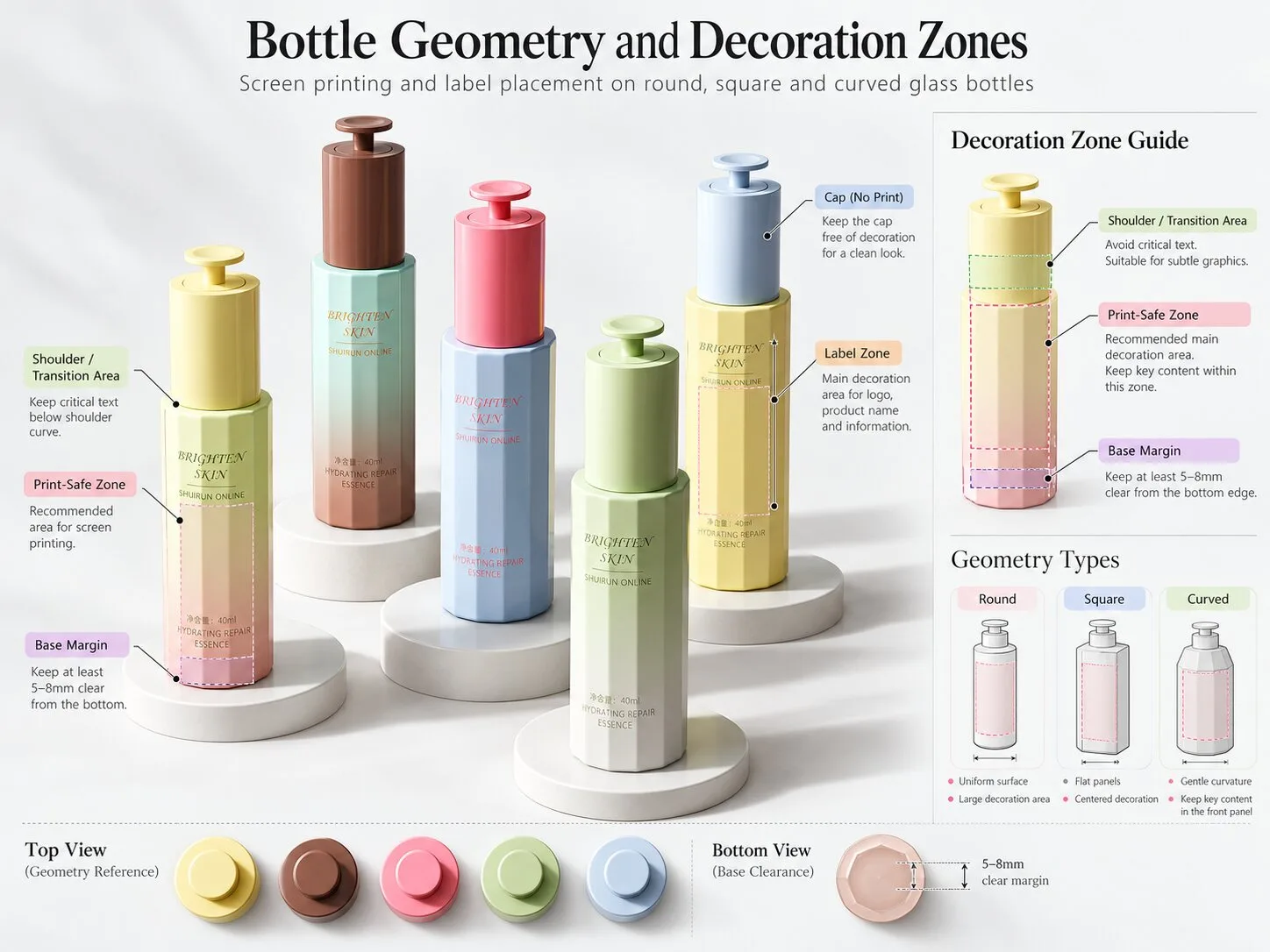
Layout planning: Logo, product name and mandatory regulatory text
The front and back of a beauty bottle often serve different purposes.
The front carries brand recognition.
A logo, product name and short descriptor usually work well with direct printing because the visual system is simple and easy to read.
This gives the bottle a clean appearance without a visible label edge.
The back often needs more flexibility.
Ingredient information, directions, warnings and market specific text can require much more space. The exact requirements depend on the product category and the market where the product will be sold.
The placement and legibility of mandatory information should therefore be reviewed against the applicable requirements for each target market.
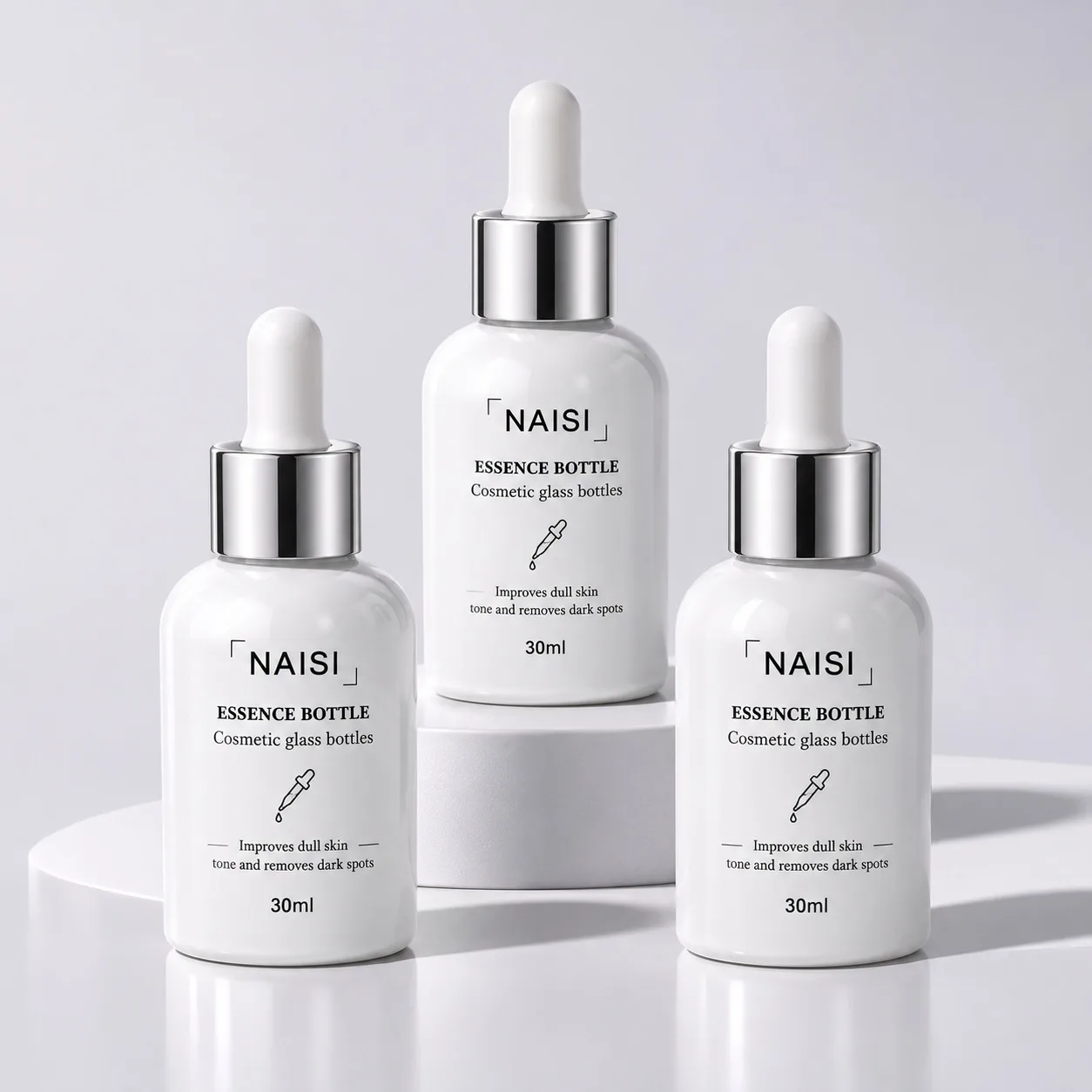
This is one reason pressure sensitive labels for glass bottles are commonly used for information panels.
Text can be updated without changing the primary bottle decoration. Different label versions can also be prepared for different countries or languages.
A mixed solution is often practical:
screen printed branding on the front and a pressure sensitive information label on the back.
The front remains visually simple.
The back label handles information that may change more frequently.
Batch or lot information may also be added through a separate coding process, depending on the filling and production system.
For packaging buyers, the important question is:
Which information is part of the permanent brand design, and which information may need to change later?
That distinction often makes the decoration choice much clearer.
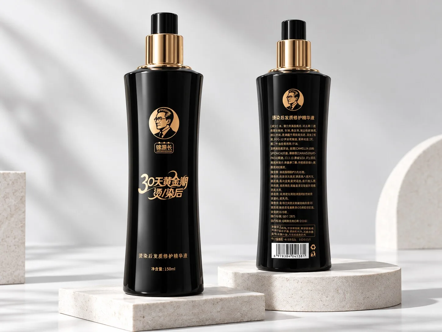
Multi-SKU & multi-language impact
SKU planning can change the economics of decoration quickly.
Screen printing requires production preparation for each approved artwork configuration.
When text, graphics or colors change, additional screens and setup may be required.
For a stable product with repeat orders and consistent artwork, this can be a strong solution.
A multi SKU launch works differently.
Imagine one 50 ml serum bottle used for six formulas.
The bottle shape stays the same, while the product names, colors or market languages change.
Using one common glass bottle and changing the label can simplify inventory planning. The brand can keep a shared bottle platform and create different finished products through the label program.
This is particularly useful during early product testing.
A new skincare or fragrance brand may want to launch several variations before deciding which products will become long term repeat orders.
Labels give the brand more room to adjust.
Once a hero product becomes stable and the artwork is unlikely to change, direct printing may become more attractive.
The same logic applies to regional versions.
A product sold in several markets may require different languages or information layouts. Using one common bottle with different regional labels can make those changes easier to manage.
This is why cosmetic packaging labels for multiple SKUs often make sense during early or complex range development.
Decision matrix: cost, flexibility, visual quality & production volume
There is no universal order quantity where screen printing suddenly becomes cheaper than labels.
The quotation depends on the actual project.
For screen printing, cost can be influenced by the number of colors, artwork size, bottle shape, setup requirements and production quantity.
For labels, the calculation can include label material, printing method, finishing, die cutting and application.
Manual and automatic label application also have different cost structures.
Visually, the two options create different results.
Screen printing lets the glass remain part of the design. Transparent areas around the artwork can make the bottle feel clean and integrated.
Labels add another surface.
This can also become a design advantage. Clear film, textured paper or a carefully chosen matte label can create its own premium character.
The production risks differ too.
Labels need appropriate adhesion and controlled application. Poor material selection or difficult bottle geometry can contribute to bubbling, wrinkles, edge lifting or positioning variation.
Screen printing requires accurate artwork preparation, suitable inks and stable production setup. Once a large batch has been printed, changing the artwork is less flexible than replacing a label version.
For screen printing vs labels on glass bottles, production volume should therefore be considered together with artwork stability.
Lower volume launches with several changing SKUs often benefit from label flexibility.
Stable repeat programs with concise logos and consistent graphics can be good candidates for screen printing.
The actual cost decision should always be confirmed through a project specific quotation.
Artwork & print file preparation guide
Good decoration starts with a production ready artwork file.
For screen printing, vector artwork is usually the most practical starting point.
Clean paths and clearly defined spot colors make communication with the printer easier.
Fine lines and very small text require extra attention. Their practical printability depends on the artwork, bottle geometry, screen setup and production capability.
Gradients and highly detailed images are more demanding than simple solid graphics.
They should be reviewed with the printer before approval rather than treated as automatically suitable for standard screen printing.
Curved bottles need another check.
Artwork that looks balanced on a flat screen can appear different when wrapped around a radius.
The supplier may need to adjust artwork placement or dimensions according to the usable print area.
For labels, artwork should be prepared around the approved die line.
Include the required bleed and safe area. Allow for application tolerance when text or graphics need to align with bottle edges or molded features.
Material selection is equally important.
The face stock and adhesive should suit the glass surface, bottle geometry and expected storage and use conditions.
Sampling should come before mass production.
For screen printed bottles, relevant checks may include print appearance, adhesion, abrasion resistance and appropriate chemical exposure.
For labels, evaluate adhesion, edge lifting, bubbling, wrinkling and alignment under representative conditions.
The test method should reflect the actual package and expected use.
Quick decision checklist
Use these questions before confirming the decoration route:·
Does the bottle have a broad and stable decoration area?
Yes: Screen printing may be a strong option.
Is the front artwork mainly a logo, product name and simple graphic?
Yes: Direct printing is worth evaluating.·
Does the artwork require gradients, detailed images or a large amount of small text?
Yes: A pressure sensitive label may offer more flexibility.
Are several SKUs using the same bottle?
Yes: Labels can simplify artwork changes and inventory planning.
Will the same product need several language versions?
Yes: Regional labels may be easier to manage.
Is the artwork expected to stay unchanged across repeat orders?
Yes: Screen printing may suit a stable long term program.
Does the bottle have a tapered shoulder, strong curve or recessed area?
Yes: Confirm the usable decoration zone on a physical bottle before approving the artwork.
Do you want a clean front logo while keeping detailed information on the back?
Yes: Consider front screen printing with a rear pressure sensitive label.
·
These questions provide a practical starting point.
The final choice should still be based on the actual bottle, artwork, order structure and target market.
Conclusion
There is no single winner in screen printing vs labels on glass bottles.
The better option depends on bottle geometry, artwork complexity, SKU strategy, production volume and the amount of information the package needs to carry.
Screen printing works especially well for brands that want simple graphics integrated directly with the glass surface and expect their artwork to remain stable.
Pressure sensitive labels provide more flexibility for complex graphics, multiple SKUs, market specific text and information that may change over time.
Many beauty brands can also use both.
A screen printed front can carry the visual identity, while a carefully designed back label handles detailed information.
It is worth settling this before final artwork approval.
Start with the bottle shape. Define the usable decoration area. Then review the artwork, order volume and SKU plan with the packaging supplier before choosing the final route.
At NAISI Packaging, we support cosmetic and fragrance glass bottle projects with screen printing, bottle customization and decoration coordination. Artwork can be reviewed against the selected bottle before sampling to identify practical printing areas early in the development process.
Explore Our Glass Perfume Bottles
Learn About Our Screen Printing Service
Send Your Bottle Design or Artwork for Review